#AVIATION
#Research
#UX/UI
#Design System
#Design direction
ROLE: CCO

BUD.hu
Turning the Airport Shuffle into a Breeze.
My team performed a full redesign for the biggest Hungarian airport: a research-driven website redesign. We conducted stakeholder interviews, competitor and content analyses, and airport interviews with travellers.
The insights that came from it were: establish trust by having flight information consistent across devices, making the pre-trip tasks doable from home, and making the security check process less stressful. We did create Personas, Insights, and a Journey Map to ground the design and captured the wonkiness of both family planners and seasoned travelers. An intuitive website, just as dependable as good-looking.
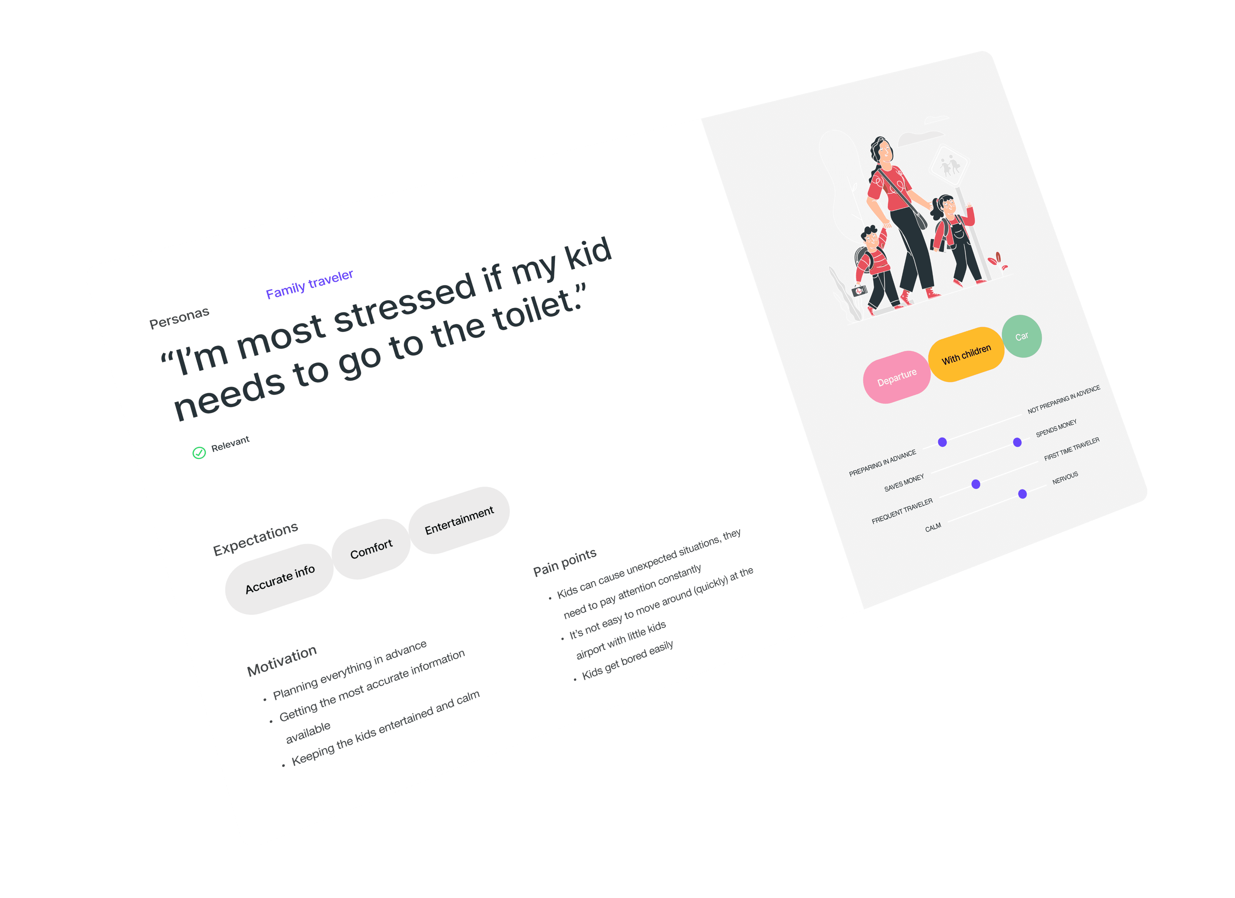
Research.
A brief summary of what we have found
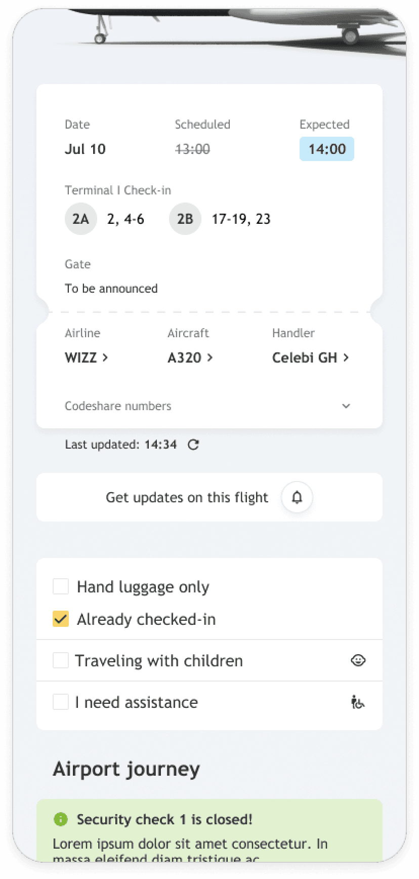
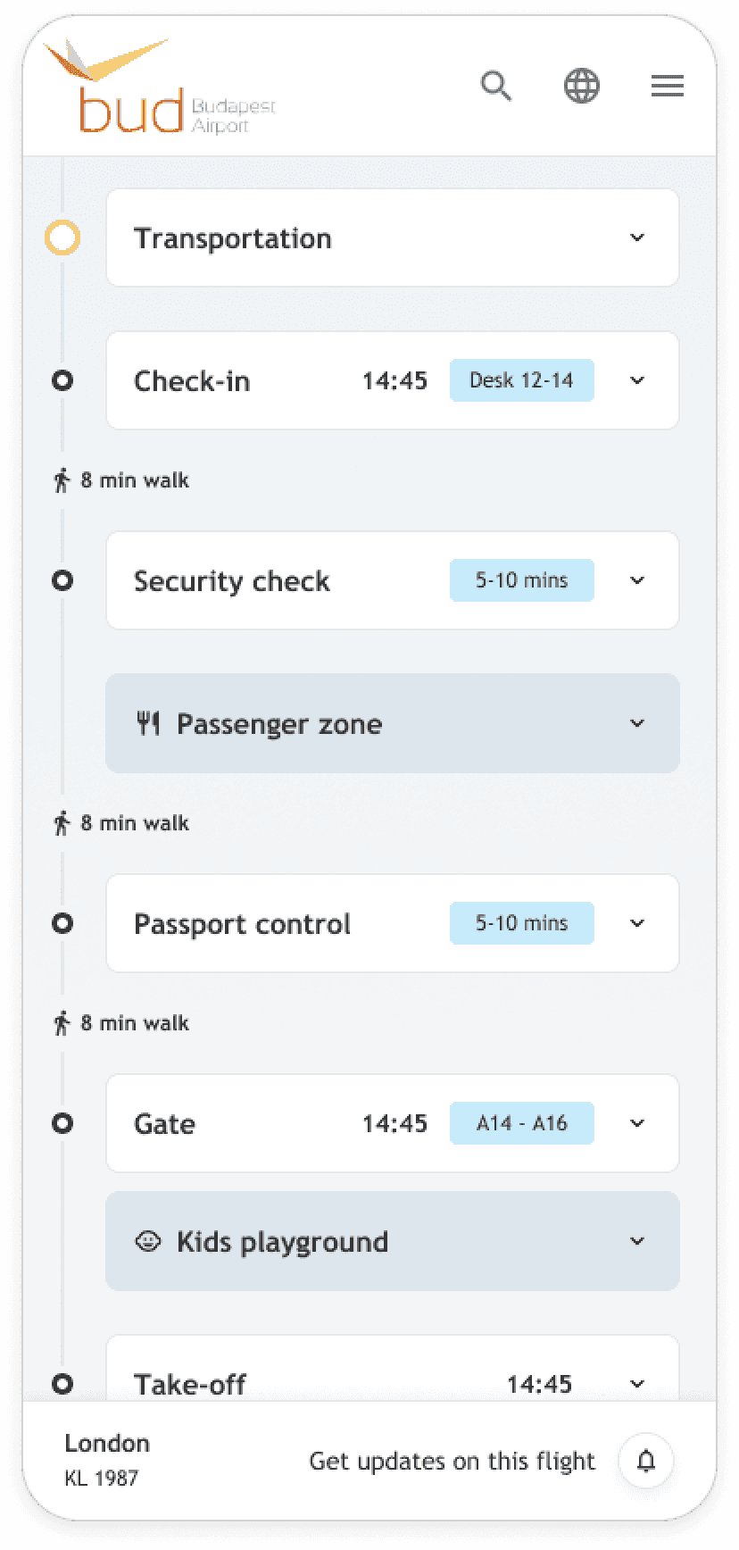
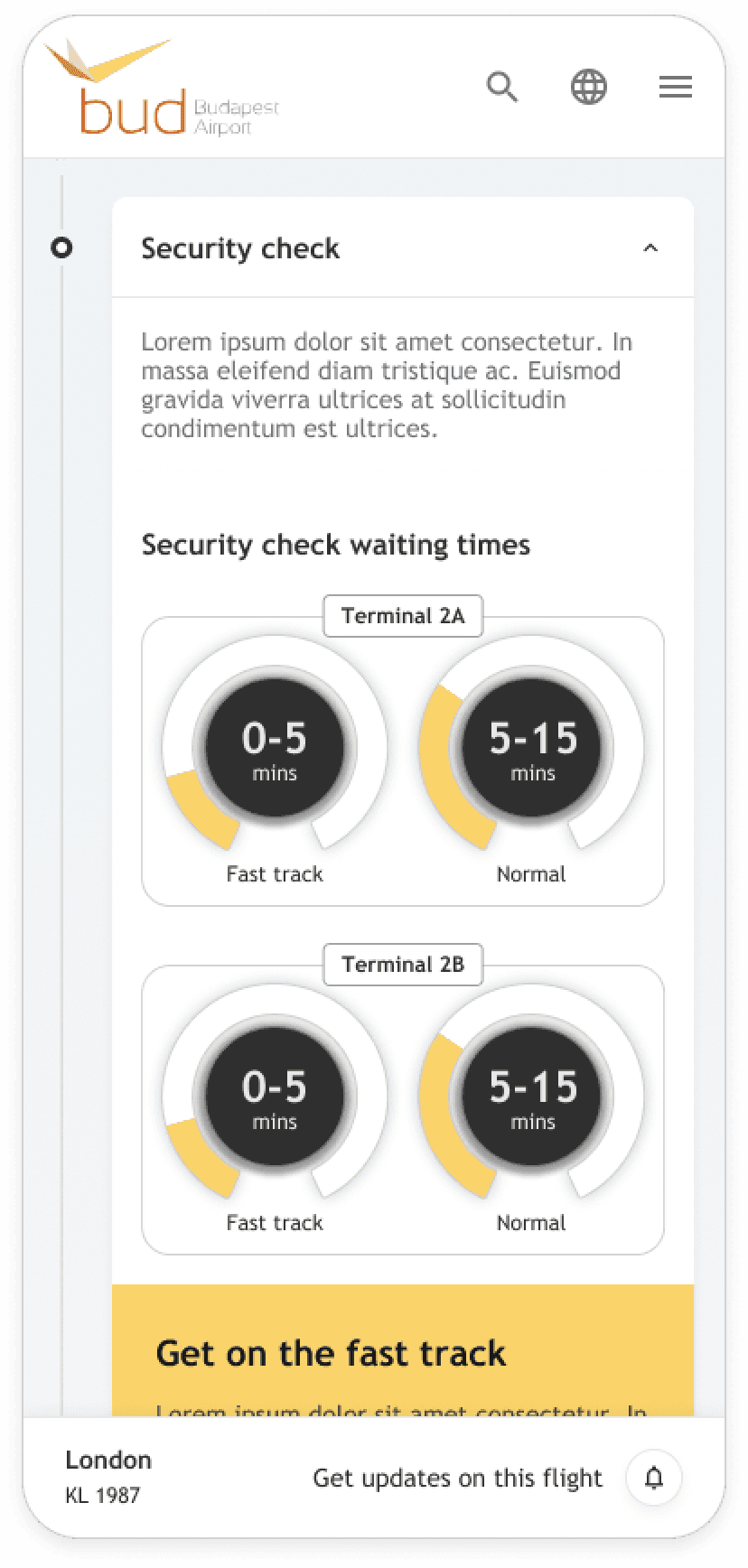
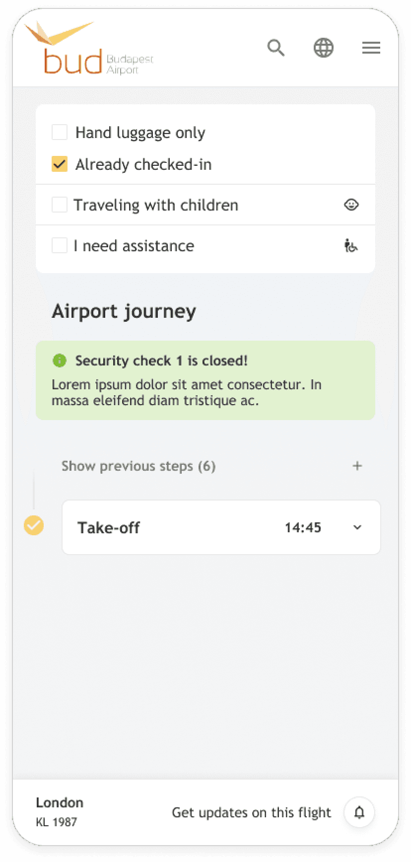
The ultimate deliverable had to be the creation of an "airport journey," thus guaranteeing that every Budapest Airport traveler would exactly know their way from door-to-door. For this, among other research methods, we have done a lot of on-the-spot research and talked with travelers right at the airport. Our findings were that consistent flight information across devices, pre-trip task management, and clear, effectively communicated security information is necessary in order to provide for a smooth security check experience.
Inputs
Stakeholder interviews
Competitor analysis
Content analysis
Airport interviews
Outcomes
Personas
Insights
Journey map
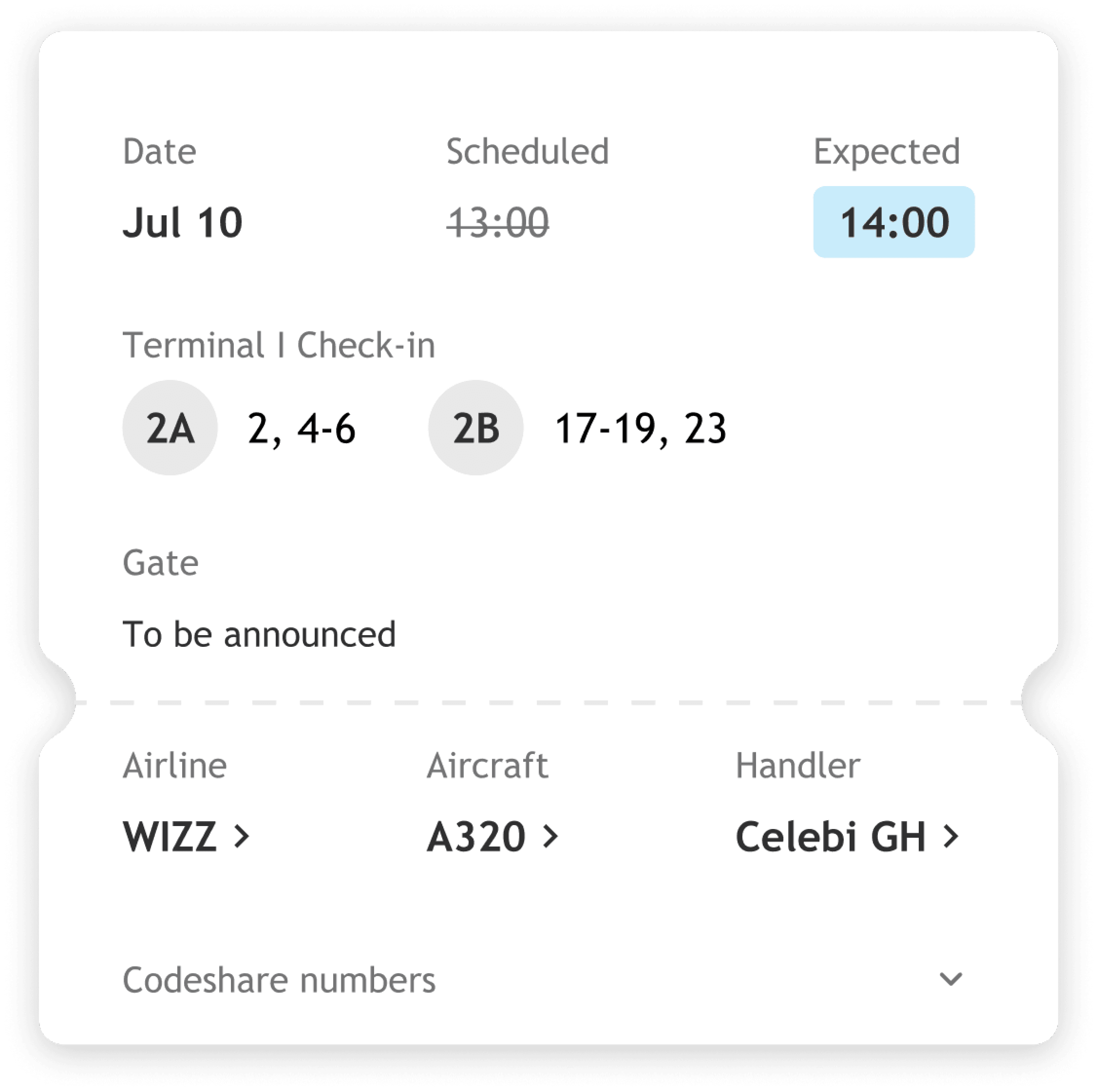
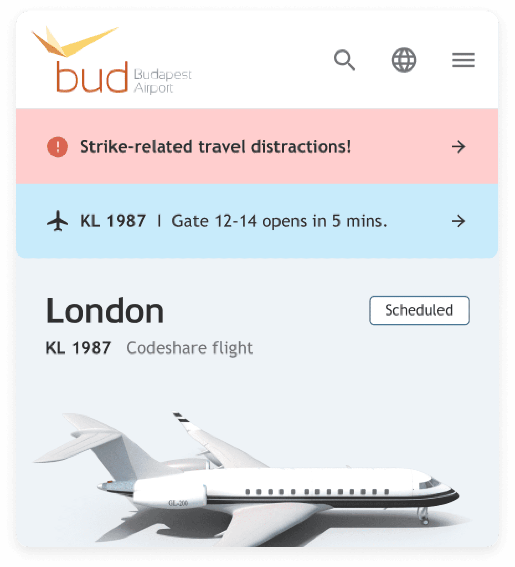
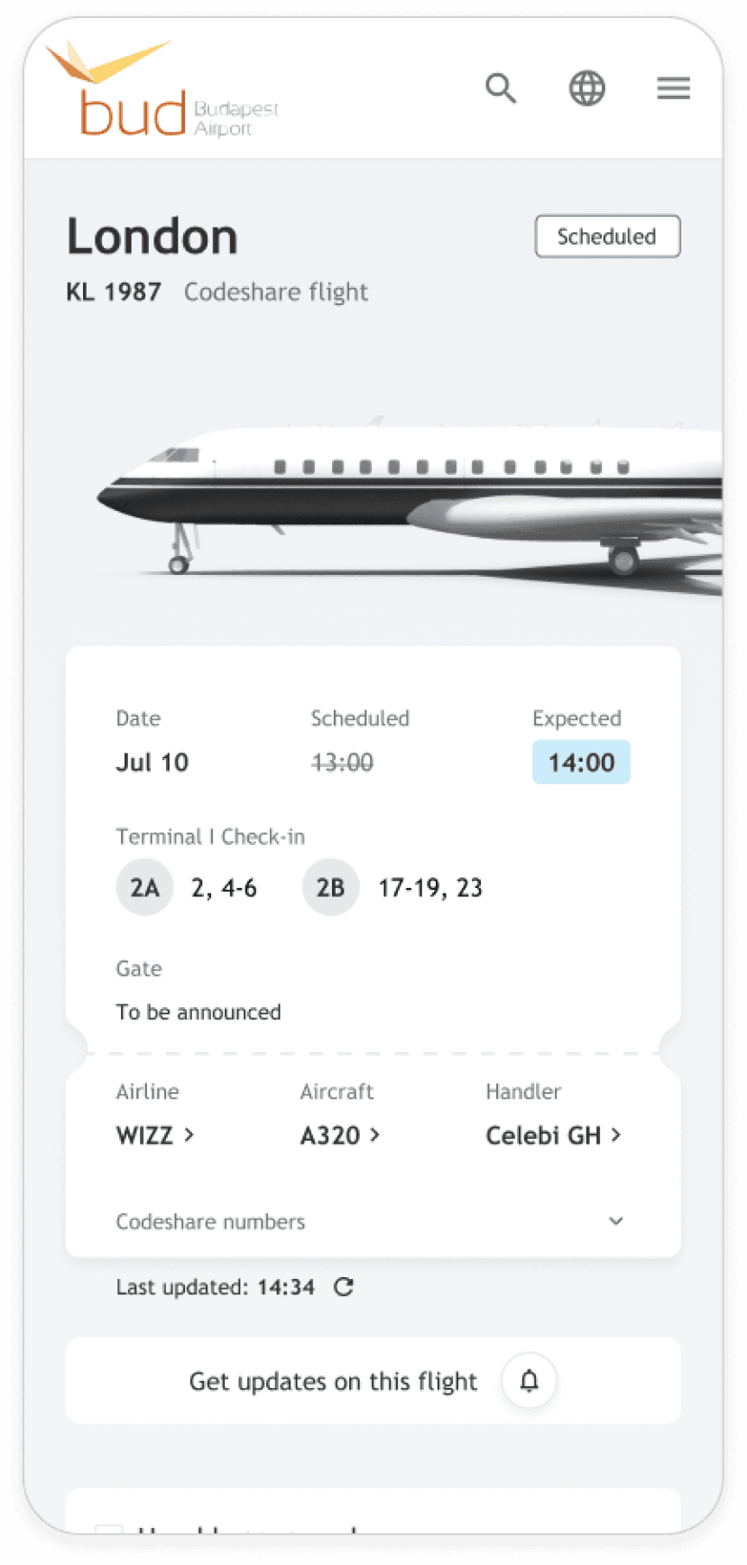
The website ensures trust by displaying the same flight info on both phones and big boards.
Non-flight related information was only checked by using the signs and boards.
The journey could start from home to help taking care of as many pre-trip tasks as possible.
Family members often plan trips for young or older travelers, who then embark with minimal preparation.
Experienced travelers are mainly interested in the gate information.
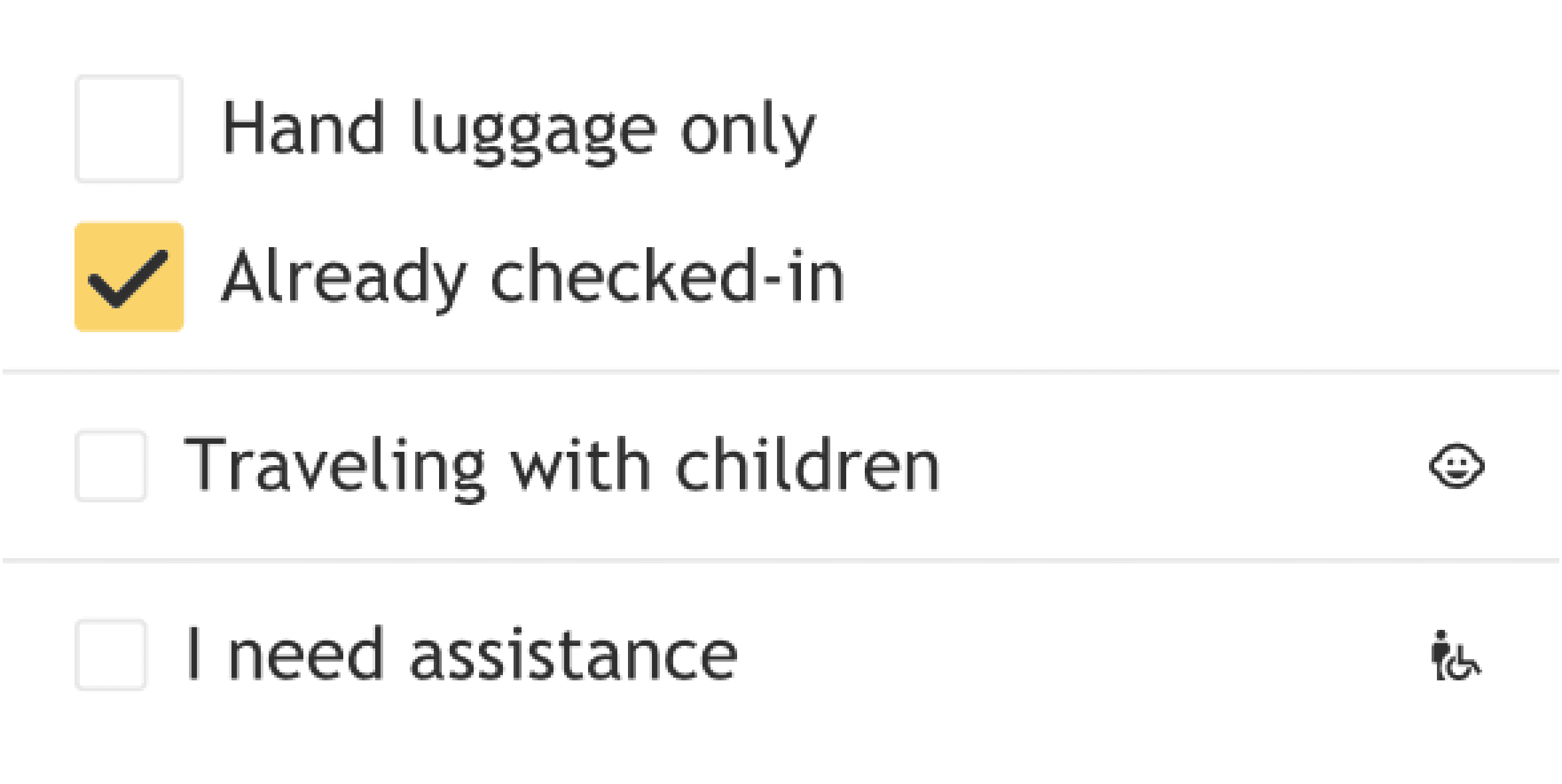
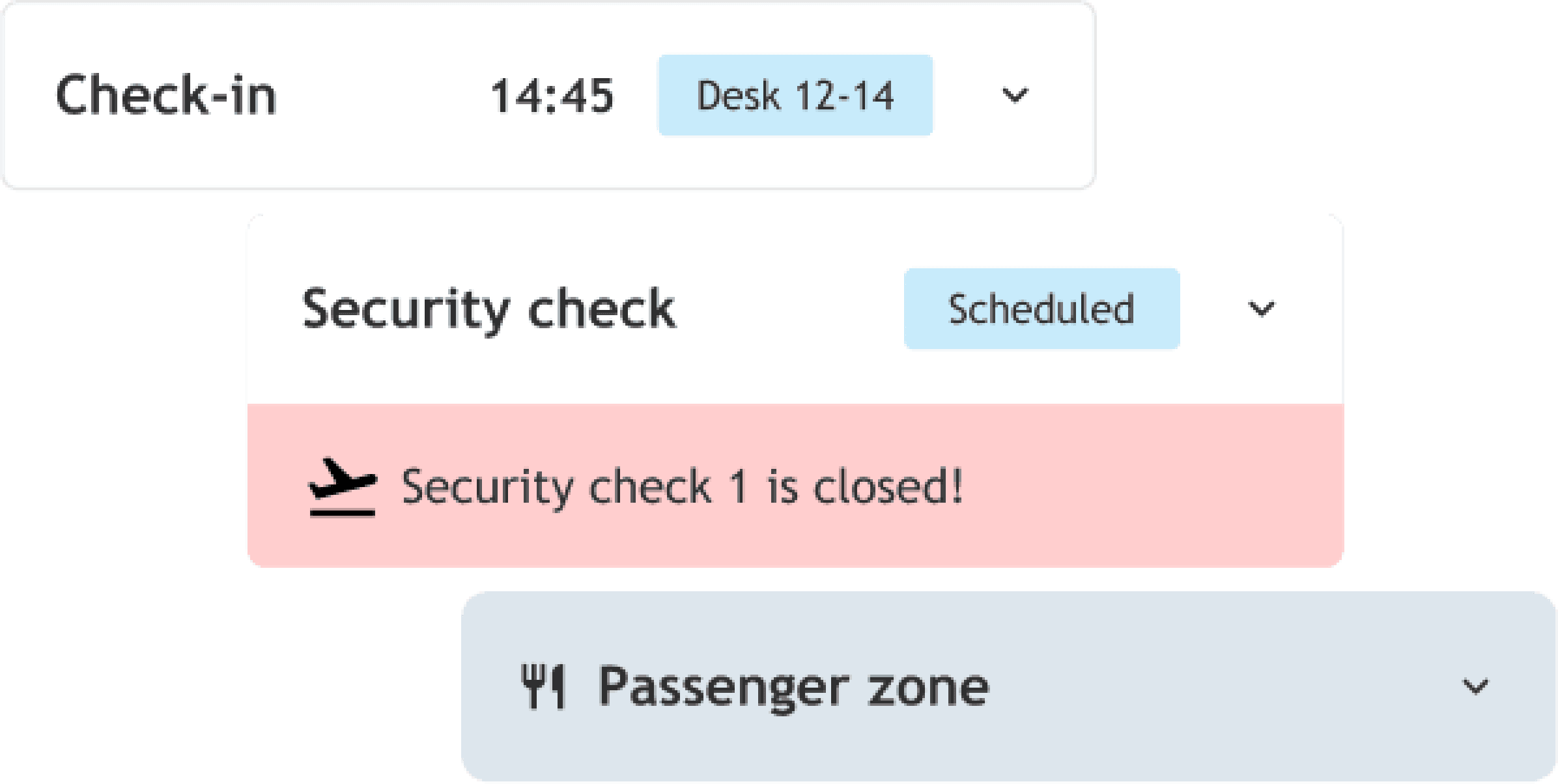
The security check is the most stressful moment.
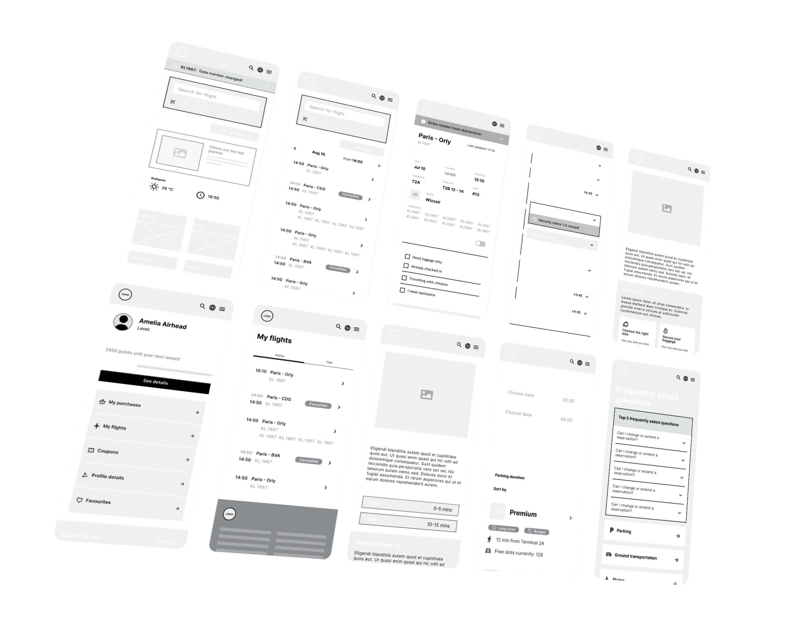
Wireframing.
From UX to UI, we freaked out, creating an airport website smooth as a first-class lounge. Our wireframes were so tight, even the pilots took notes. We transformed airport chaos into digital Zen pixel by pixel.
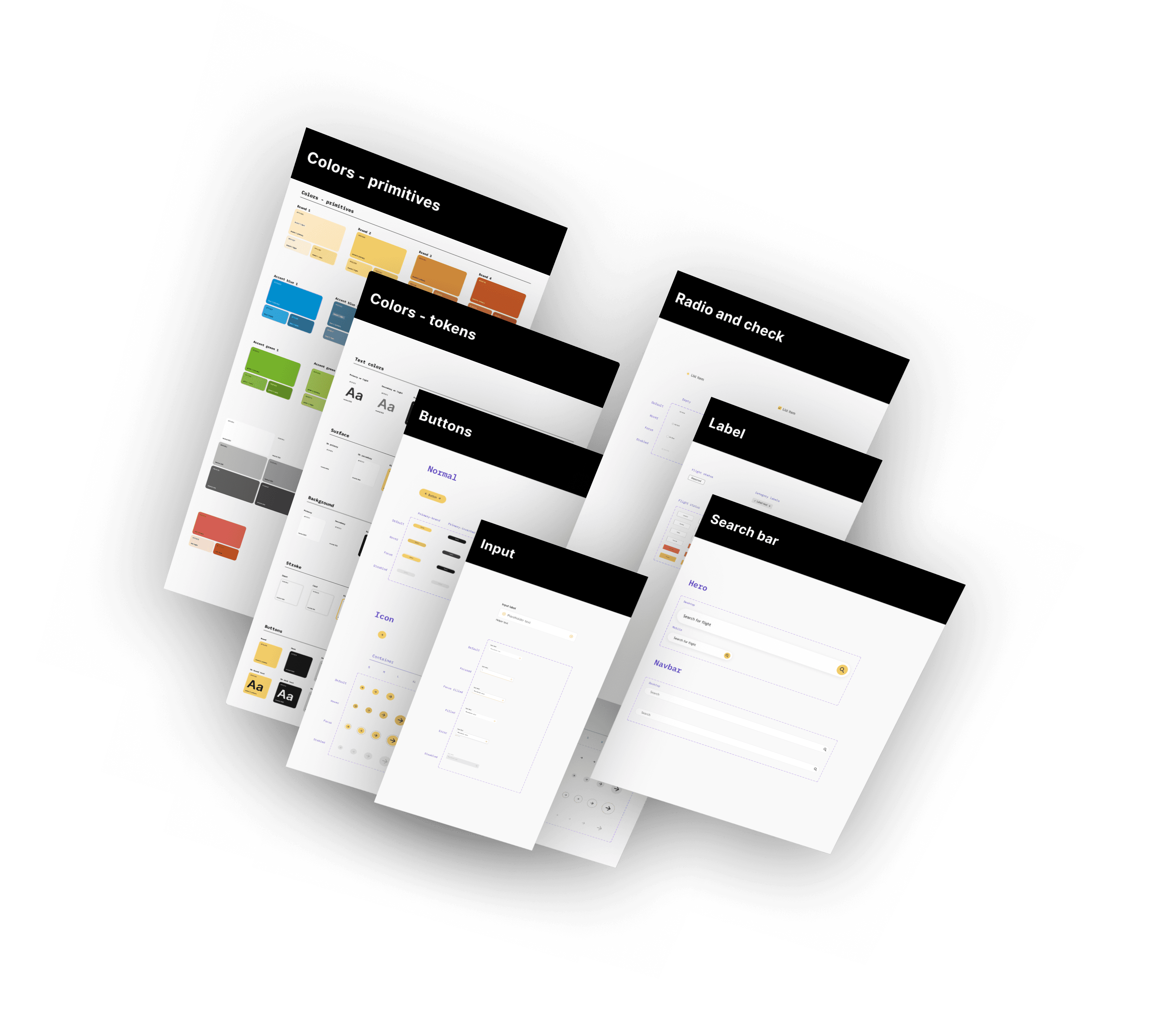
Design system
Based on design tokens, we designed a sleek design system that would facilitate theming with ease for the B2B and B2C sites, including service mini-sites of Budapest Airport. This dynamic system keeps the branding razor-sharp, while user experience is always high.
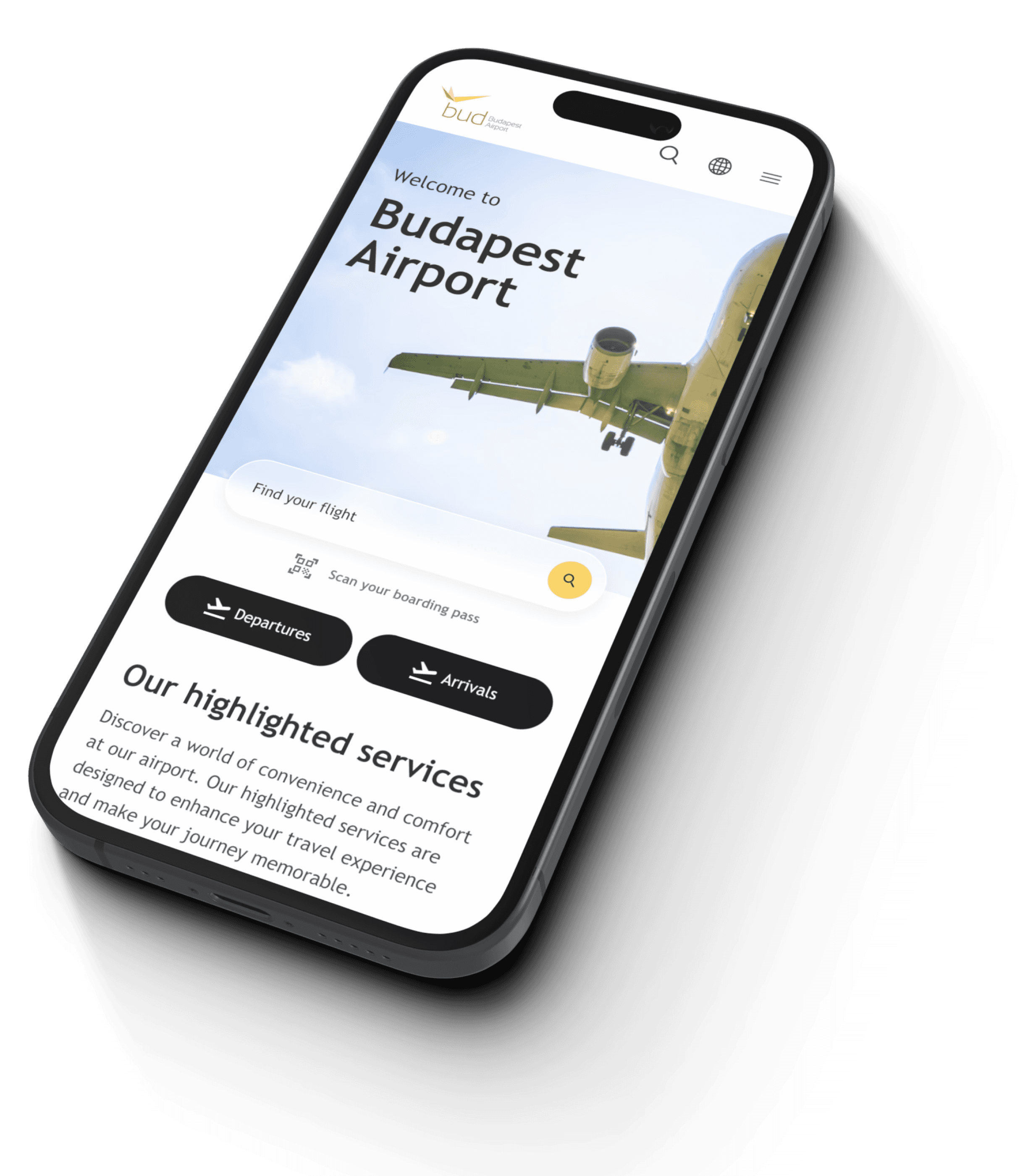
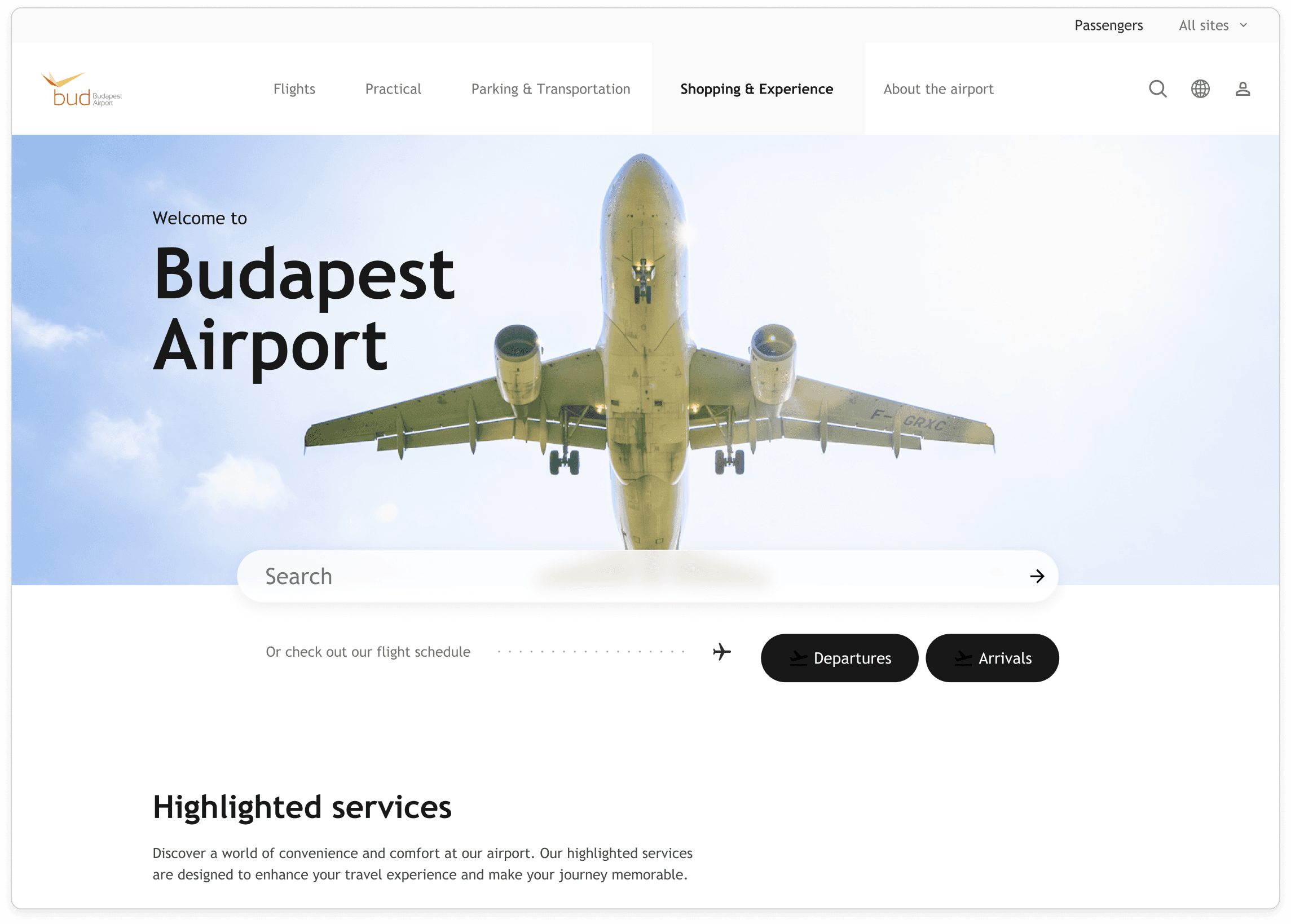
Home.
Home is where the heart is
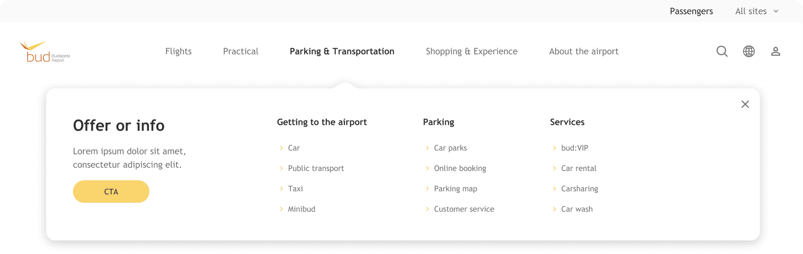
New Menu Structure
The information architecture redesign aimed to reduce clutter even further by enhancing clarity: show priority for the most essential items and set clear categorization for related content. This way, we got a slimmed and user-friendly menu.
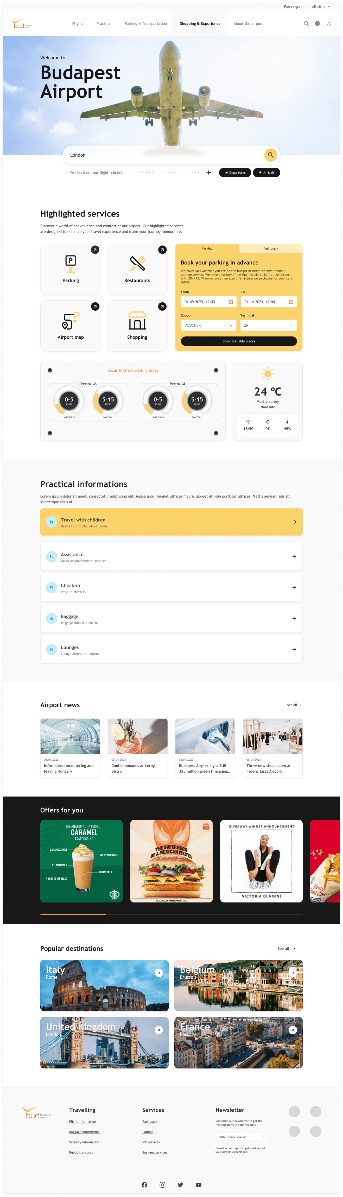
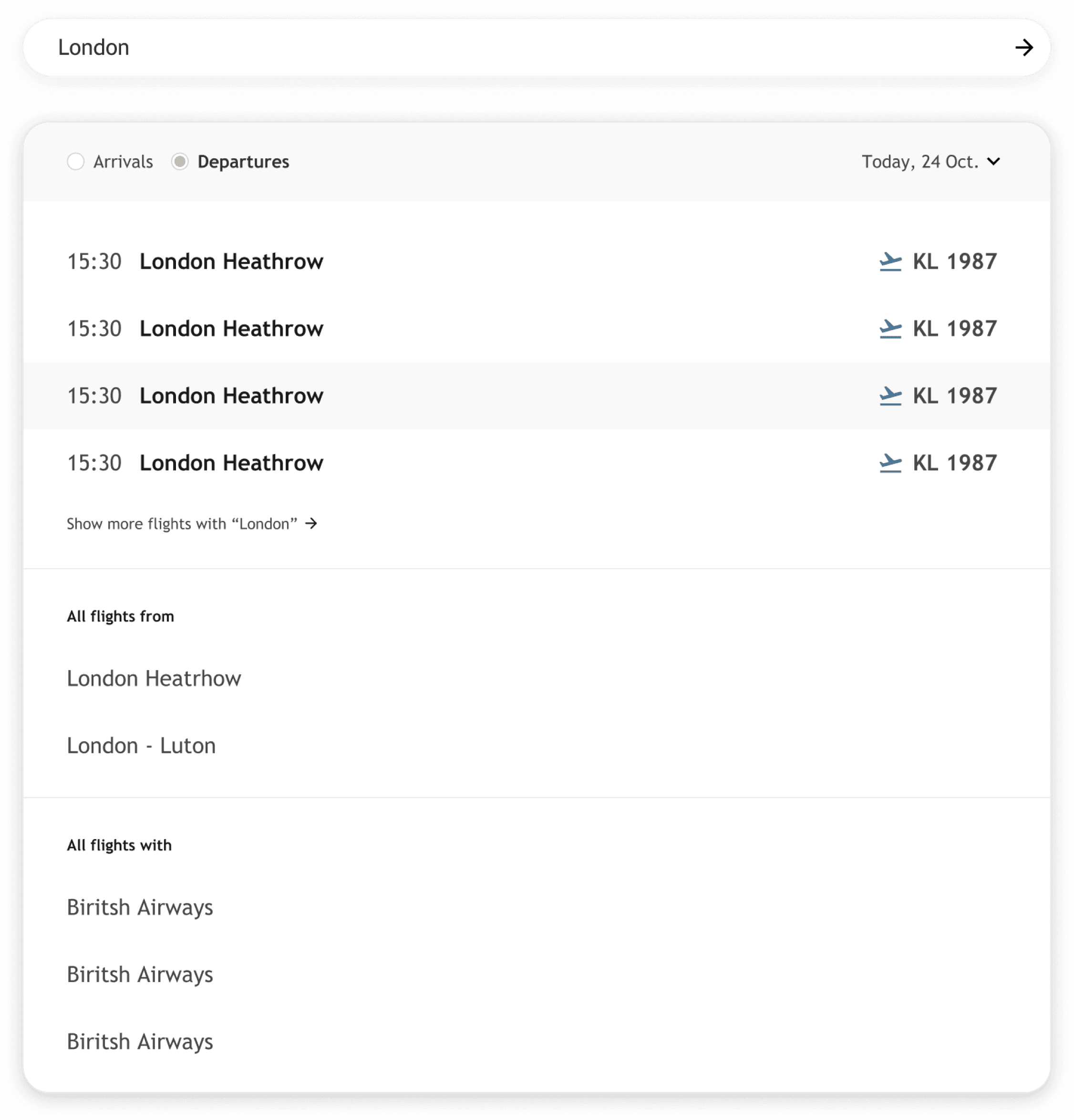
Refreshed Search
Redesigned a search bar contributing much to improving overall performance and user experience.
More accessible: It's cleaner and easy to scan.
Efficiently aiming at reducing the time for finding relevant information.
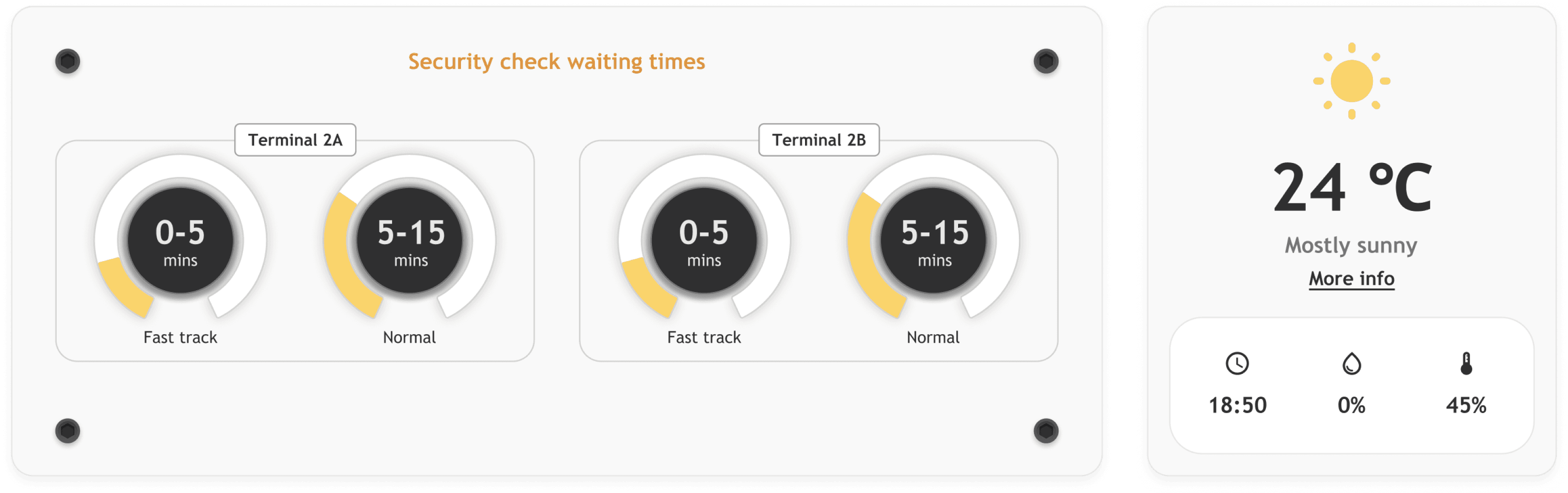
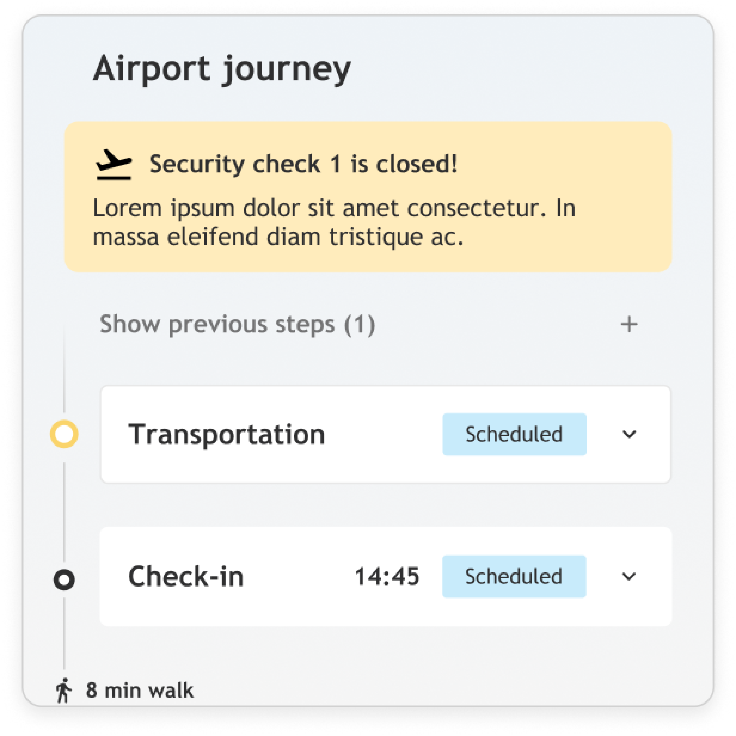
Dashboard style info display
Aviator-style data displays for service information and weather.
This will be helpful in building an integrated, user-friendly environment where it is also a consistently designed engagement builder eye-candy adding sophistication to the overall look and feel.


Thanks!
Check out my other projects too.